Reimagining automotive diagnostics with human-centered UX
Explore my redesign journey for OTR Performance's app, where in-depth user research and usability testing led to a more efficient and user-friendly diagnostic experience.
Industry
Automotive
Year
2021
Role
UI/UX Designer
Platform
iOS, Andorid
Project overview
A customer approached me with a clear aim: they needed to revamp their existing mobile app. Their focus was on making the application more intuitive, eye-catching, and simpler to use. Their primary goal was to forge a smooth and complete user journey making sure customers would dig the app and see it as a better resource than it used to be.
Design challenge
Upgrade the current app's user experience and design
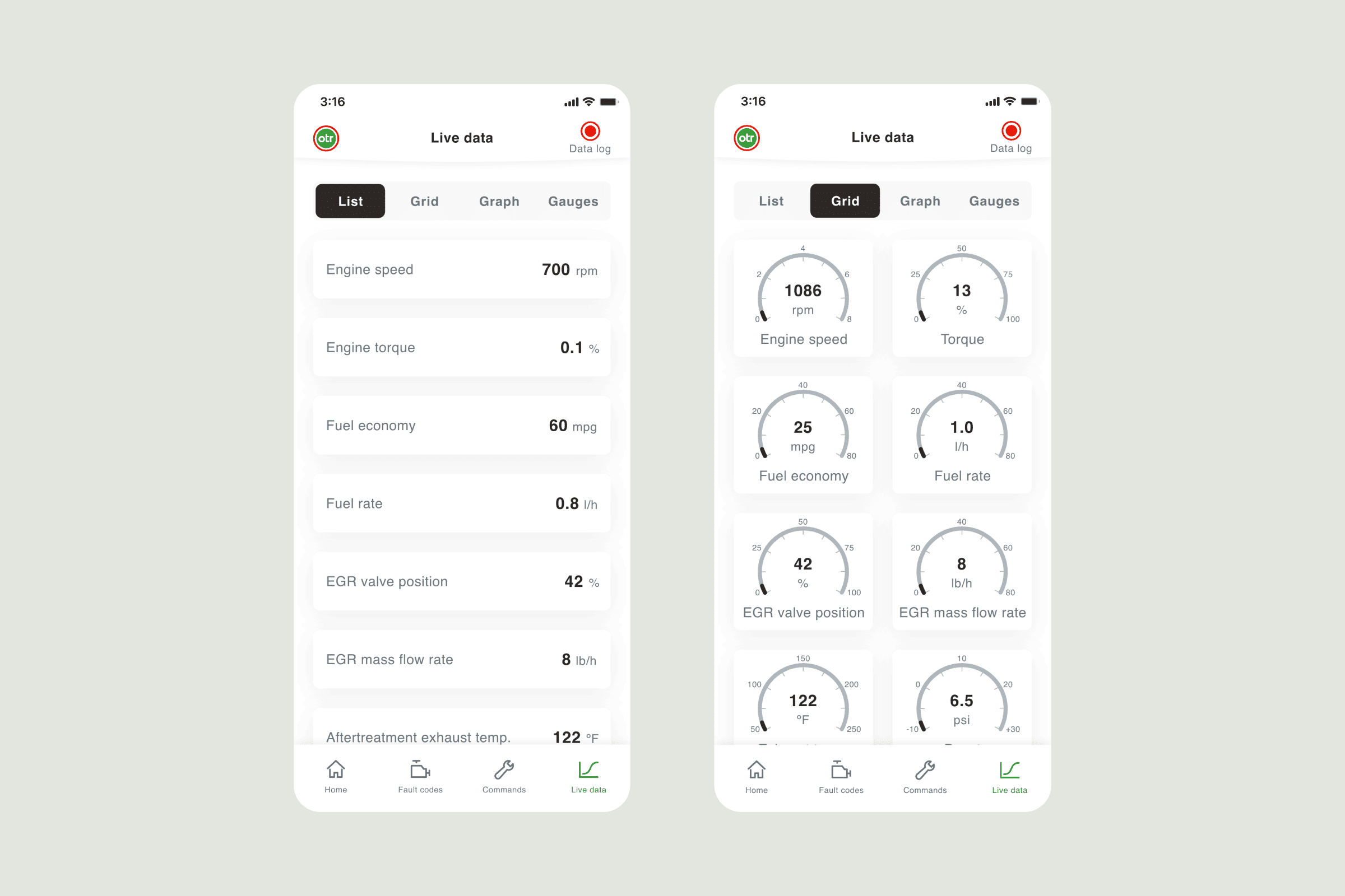
Add new functions like live vehicle info
Reorganize the way information is structured to make finding stuff easier
Make sure more people can use the app no matter who they are
Digging deeper
We kicked off the project by taking a deep dive into the app as it stands now getting to grips with how it's doing. We also made sure to figure out what users need by looking at their requirements super carefully.
Here's the scoop on what I found out:
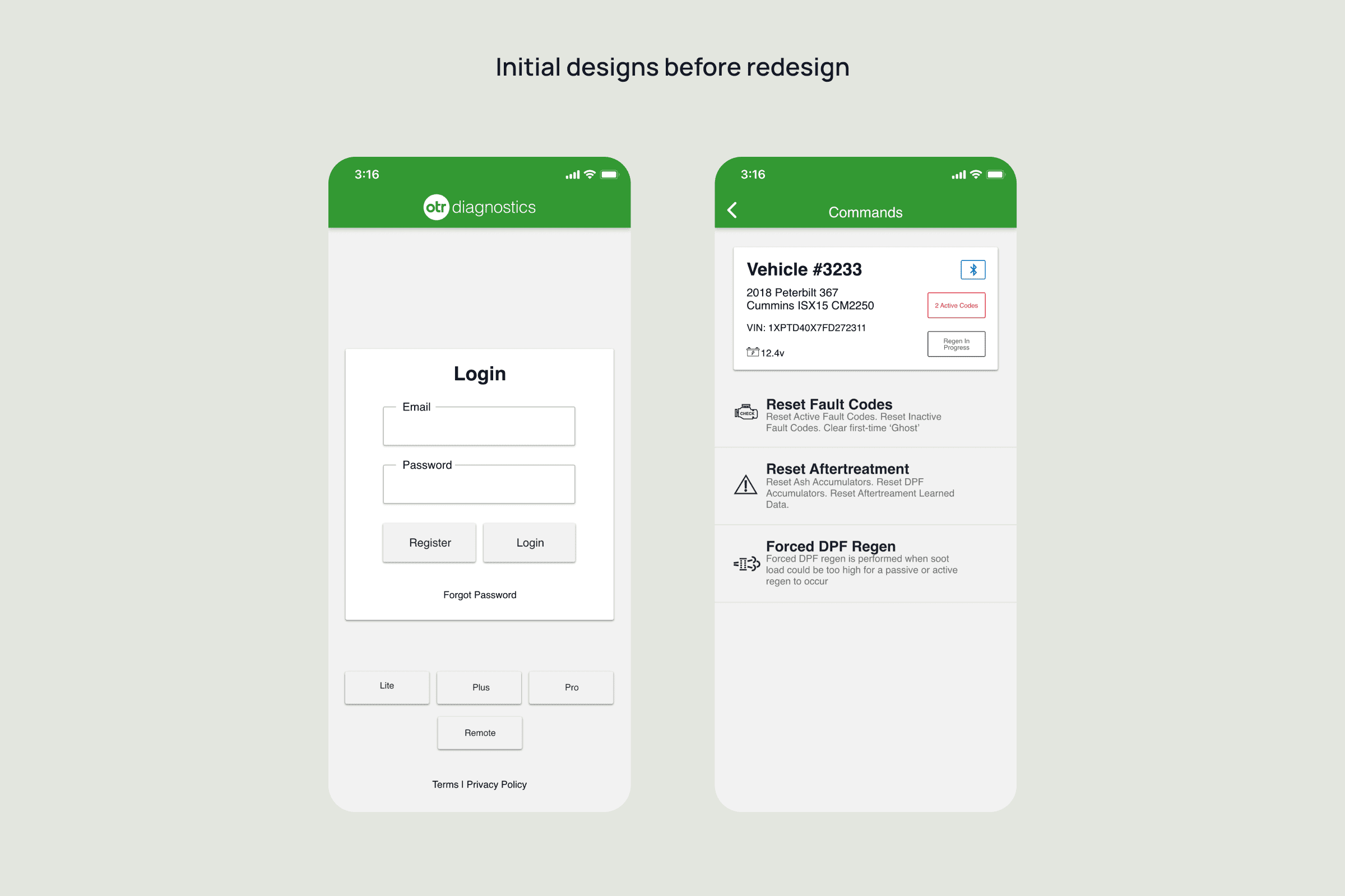
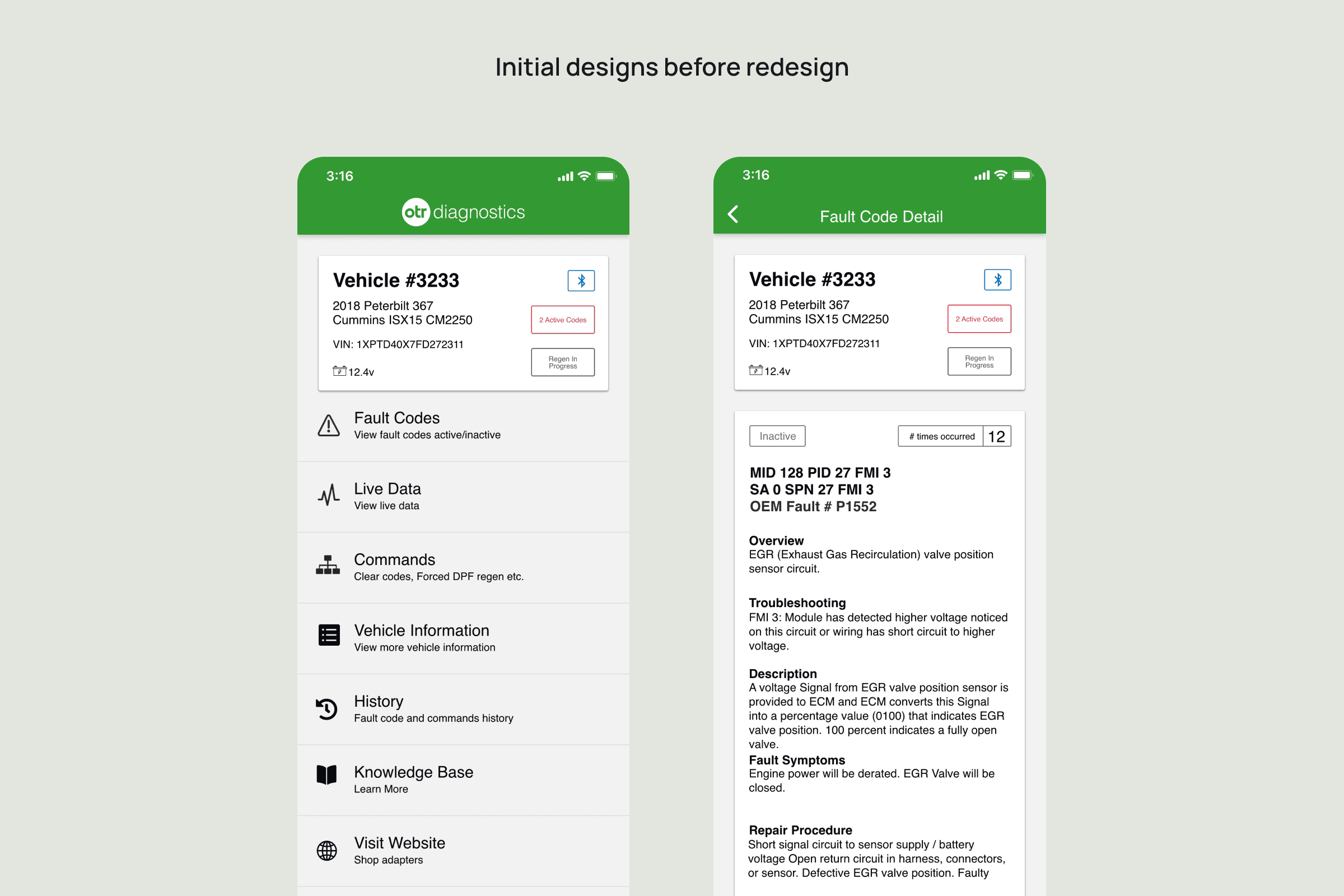
The font sizes turned out pretty tiny, which made the words tough to see. On top of that, there wasn't much contrast which messed with how clear stuff looked. All the tappable parts and buttons were super small too, and wow, did that get on people's nerves. Plus, the way you got around the app just didn't work when they tried to add new stuff.
The whole design thing
So, with all that info in my head, I dived into a real deep design game plan:
User Stories: I put together a bunch of user stories that took a good hard look at what people need and put those needs first. We used this list as our North Star when we gave our design a makeover, making sure we always kept our users in mind.
Information Architecture: I explored further into various user journeys and the way information gets laid out. Did loads of looking around and tough tests to nail down the best way to do things that's also pretty smart.
Wireframing: We made wireframes to see and try out different setups. This made sure our end design would fit what our target folks wanted. It also made team chats and working together easier since we could just show and talk about the wireframes to get on the same page and choose the best design moves
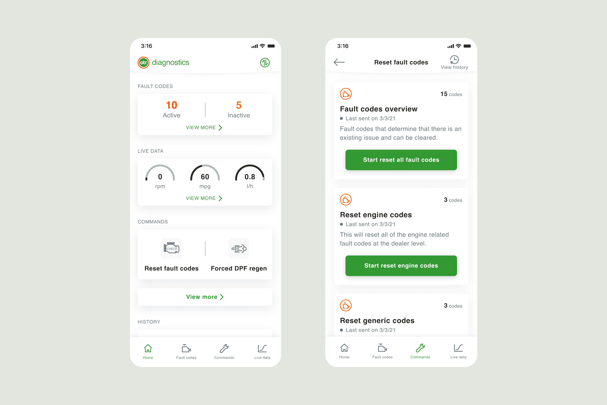
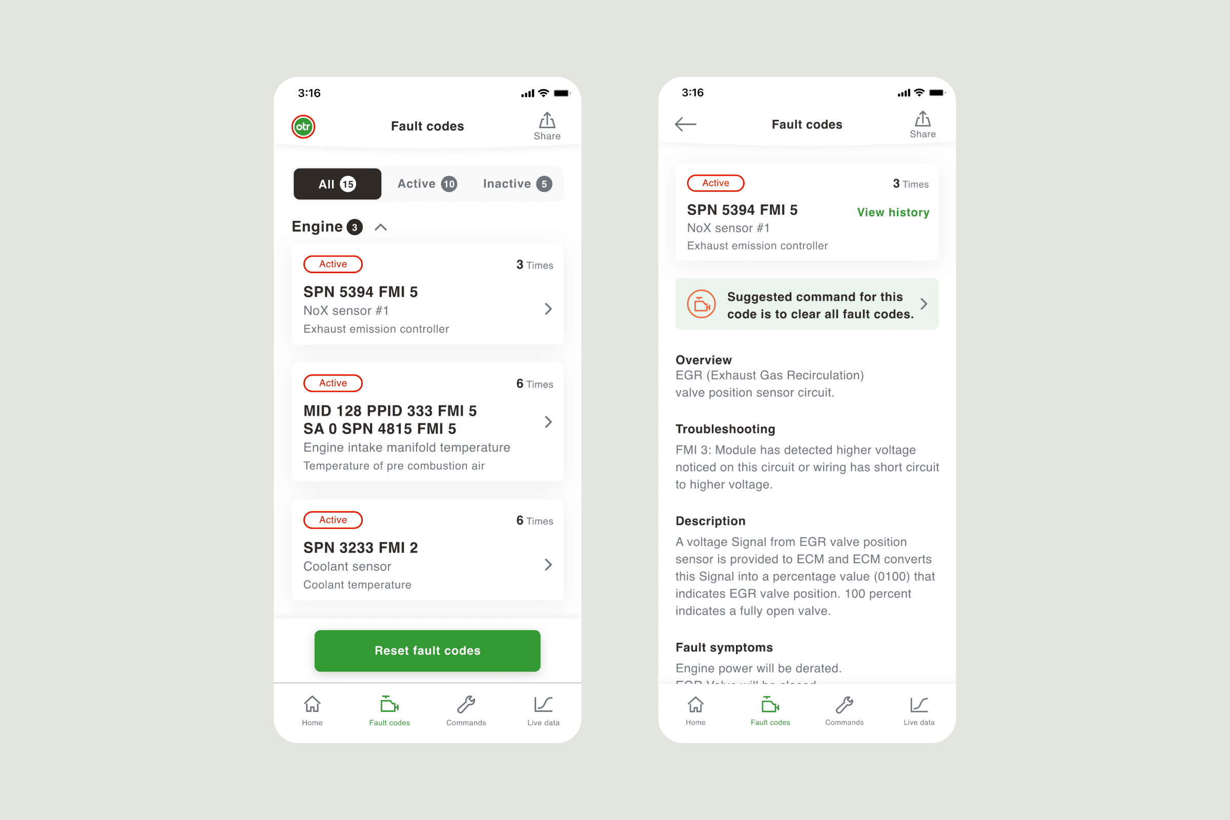
High-Fidelity Design: After agreeing on the top plan, we moved on to create polished and eye-catching designs for each part of the app.
"Design is not just what it looks like and feels like. Design is how it works." - Steve Jobs
Crucial solutions in design
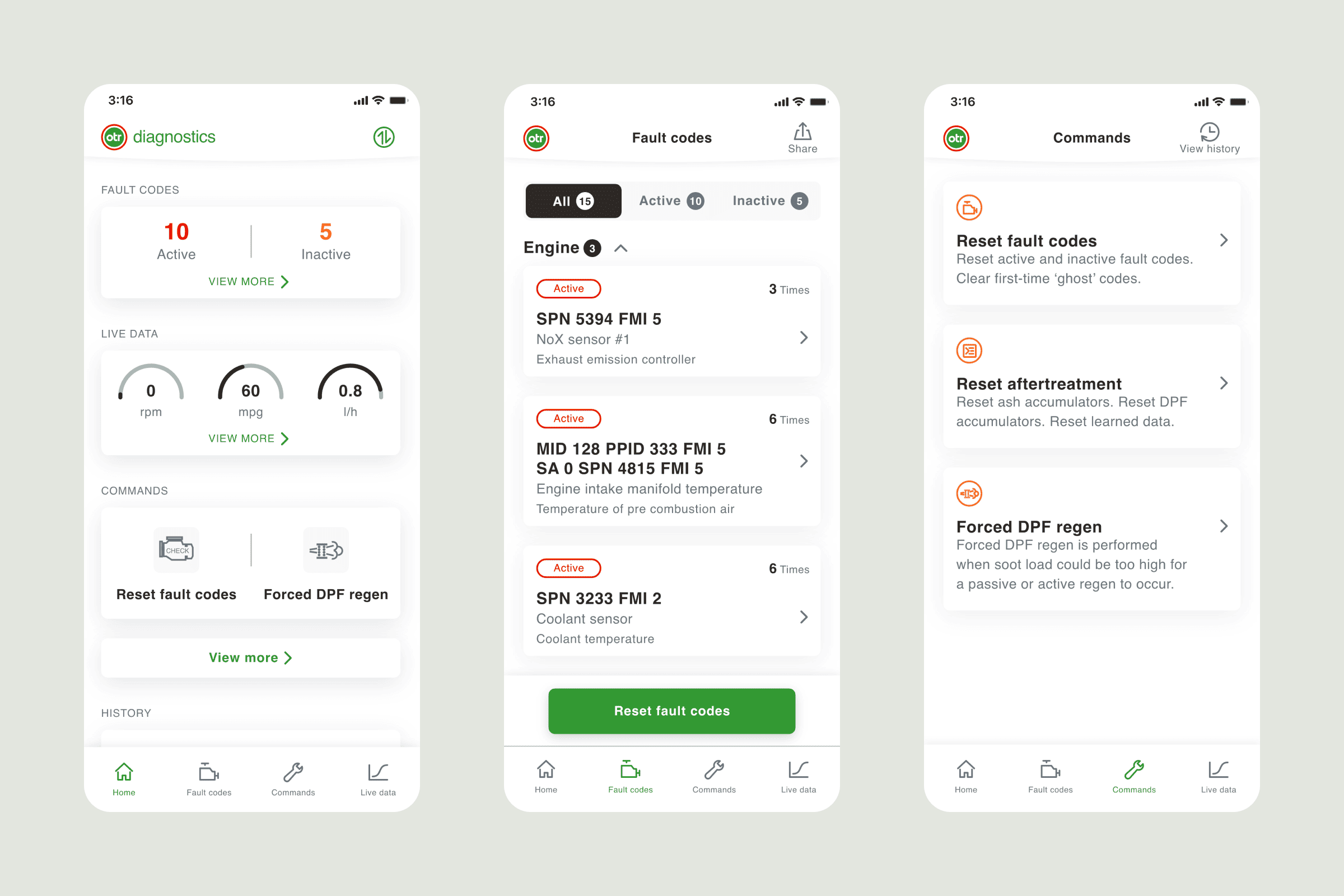
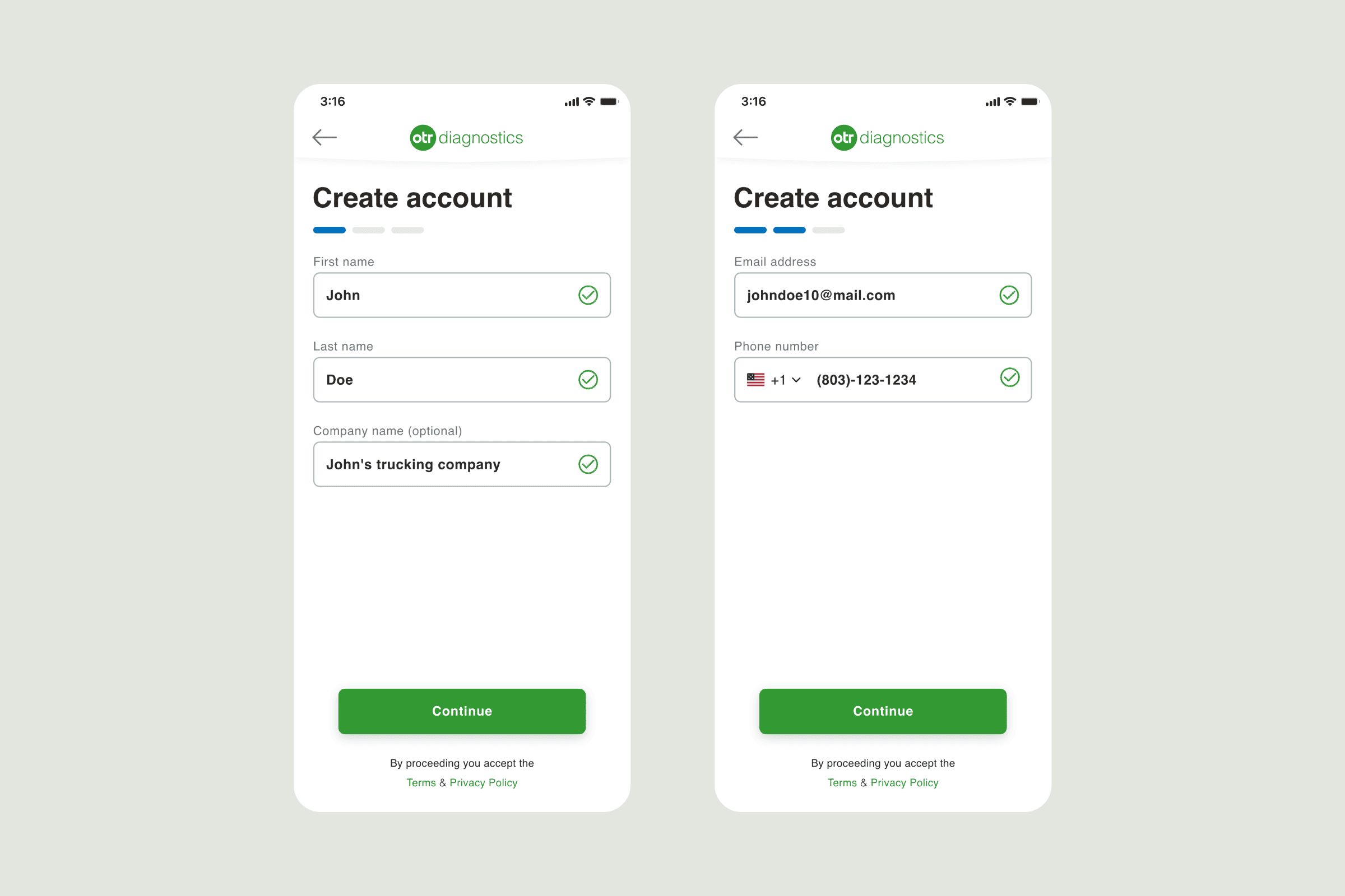
A makeover addressed core issues while also boosting how the user engages with the item.
Boosting Readability: I've made a bunch of tweaks to the app, which make sure it's super usable for people with all sorts of vision. One thing I did was pump up the text size so that folks with not-so-great eyesight can make out the words better. On top of that, I gave the color contrast a boost. This is mega helpful for anyone struggling to tell colors apart or if their sight's just not that sharp. It's mega important 'cause we want everyone to have a chill time using the app, no matter how their eyes work.
Smooth Sailing Navigation: We've got this new way of getting around in the app that's slick 'cause it's got all the latest features woven right in. It's like everything just flows together, and you don't get hung up on anything. Plus, getting from point A to point B in the app is a total breeze now.
User-Friendly Interface: I stepped up to make things easier for our users. Now we got bigger buttons and wider touch zones. I focused on folks not that into tech aiming to make everything super straightforward for them to use.
Streamlined Information Architecture: So here's the deal, I shuffled the content around for better sense, which is like making it weigh less on your brain. By tidying up the info, people can cruise through it all without getting tied up in knots. It's not just about a smoother ride though—it's also about making sure all the info hits you clear and sharp.
Results and effects
The client and users dig the revamped app stoked about the updates.
Everyone's paying more attention to the refreshed app giving it thumbs up and sticking around more. These good vibes show the design team nailed it thinking about what the users wanted.
Users are giving a big yes to the new stuff saying it's super easy to use and makes everything better for them.
The success of the revamped app comes from careful attention to detail and dedication to creating a product that improves the user's interaction and happiness.

