Designing a seamless property management cross-platform experience
Explore how I designed a user-centric MVP for property management, creating a seamless experience that bridged the needs of owners and tenants alike.
Industry
Real estate
Year
2024
Role
UI/UX Designer
Platform
iOS, Android, Web
Project overview
The client reached out to me to help the team create a minimum viable product (MVP) aiming to help property owners manage multiple properties and tenants through both a mobile and web app.
I was responsible to prioritize the features based on each group of users needs and create a seamless experience for both. Additionally, I had the opportunity to explore designing a new logo and creating a welcoming webpage using Webflow.
Design challenge
The primary challenge in this project was designing an intuitive user interface that catered to the needs of both property owners and tenants. These two groups got different stuff they wanna do and see. This thing had to be super easy for folks who aren't all techy but still tough enough to juggle all the tricky property stuff like watching rent payments keeping up with fix-up jobs, vetting new tenants, and sorting out lease details. It was very important to keep the look the same all across the web and mobile apps. Plus, we had to hustle with the bare-bones version to get it out the door pronto, so talking fast and tweaking things on the fly was key.
Design approach
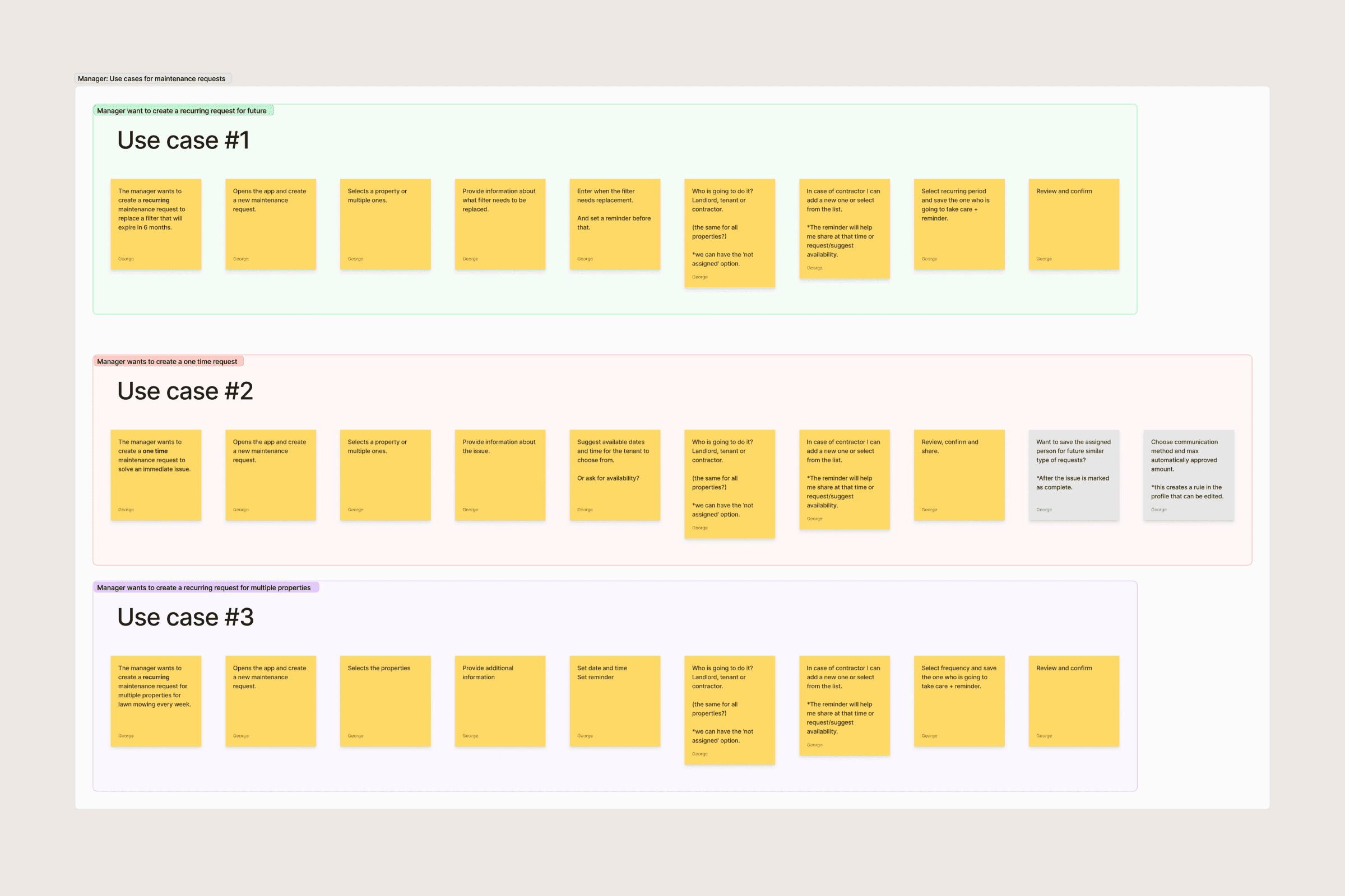
Kicked things off by having a bunch of discovery chats with the client. We needed to get the lowdown on what they dreamed of, who’d be using the stuff, and what they wanted to win business-wise. We chewed over the tough spots landlords and renters deal with. That chat shaped up our thinking for what kinds of people would use the system and how they'd go through it.
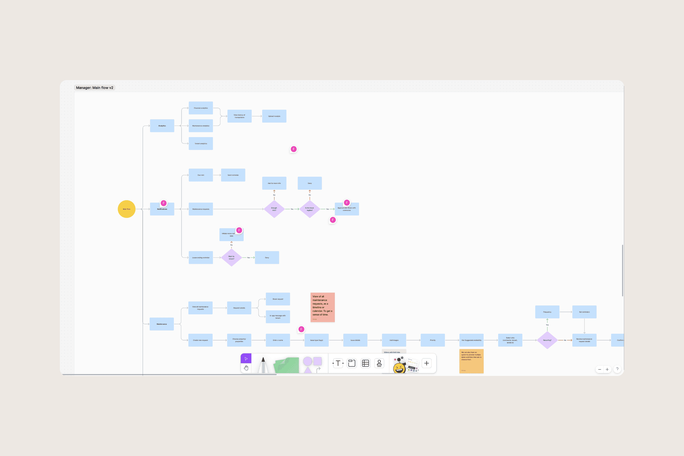
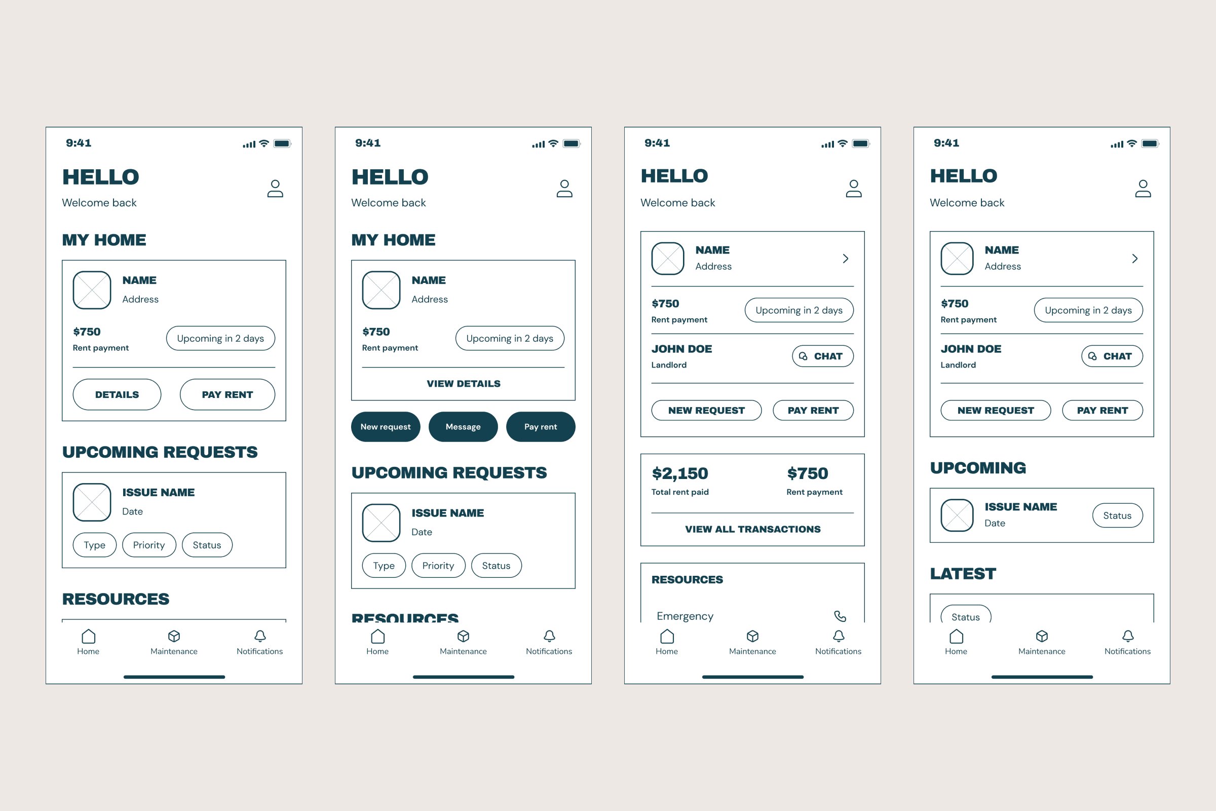
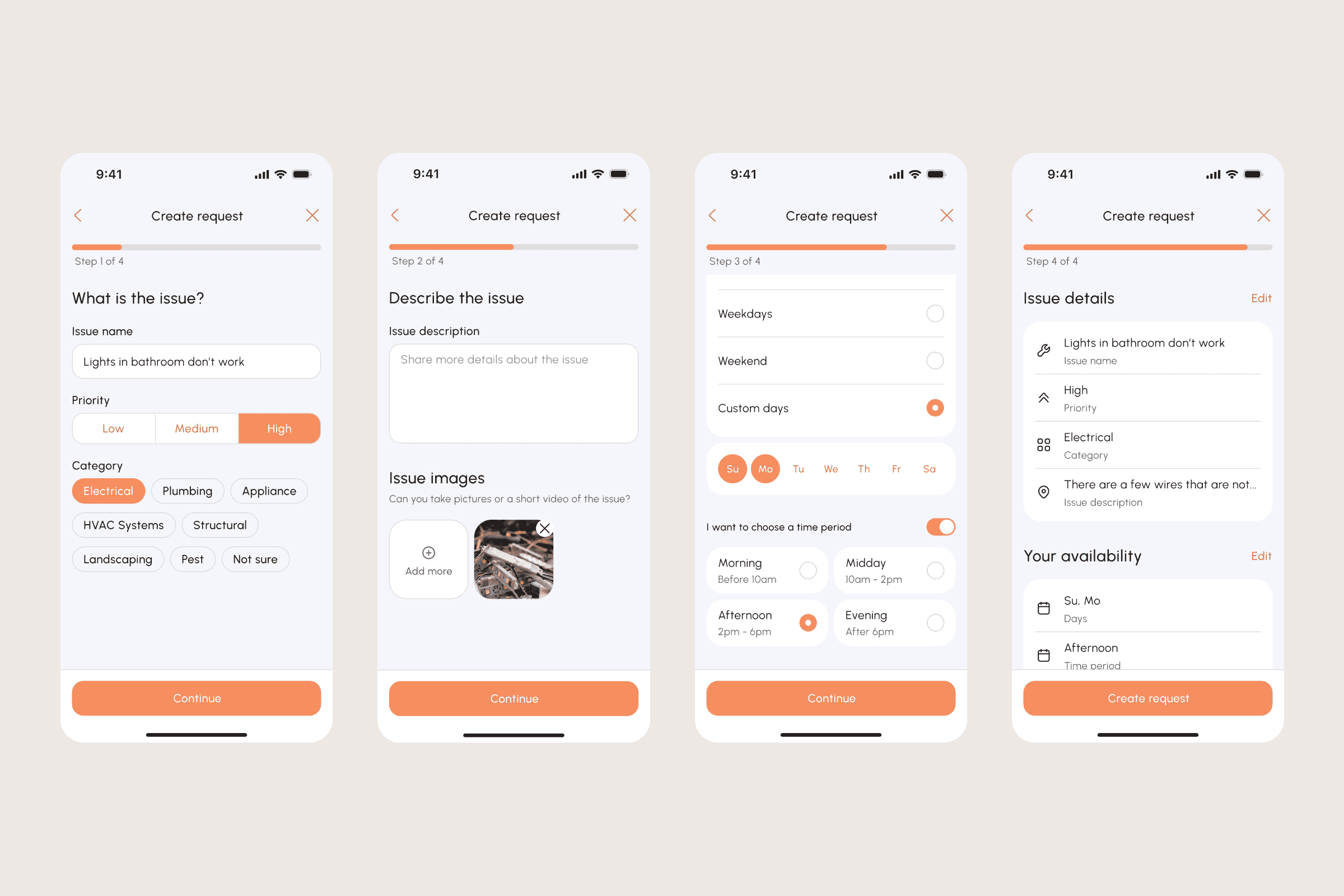
With all that great information, I enthusiastically rolled up my sleeves and started sketching the first rough drafts, focusing on the important aspects like dash views, places for rent, payment methods, and requesting repairs. My main goal was to keep it simple and easy to understand, ensuring that even those who aren't tech-savvy could navigate without any trouble.
High-fidelity designs
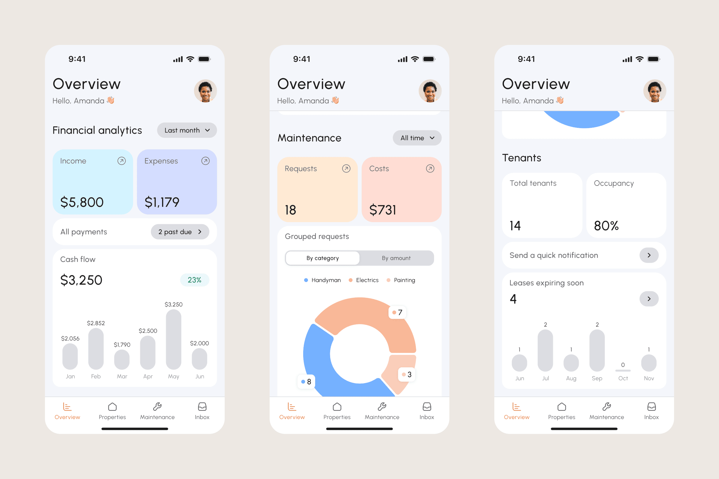
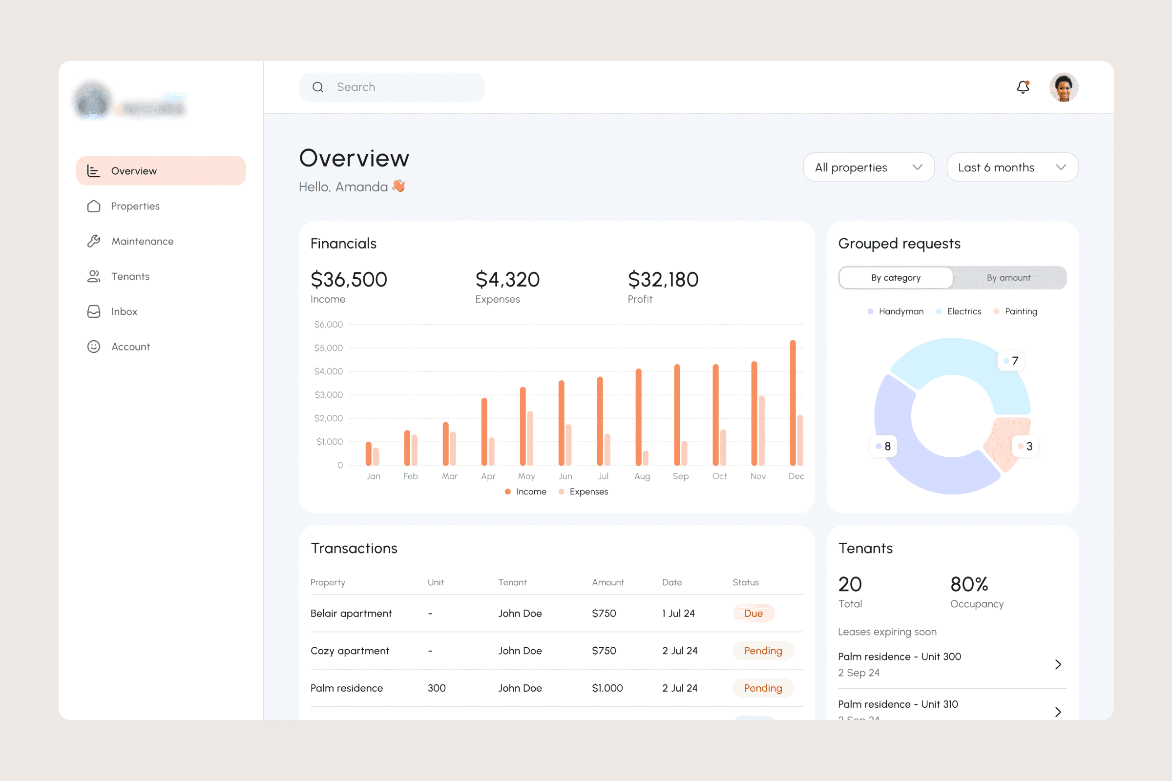
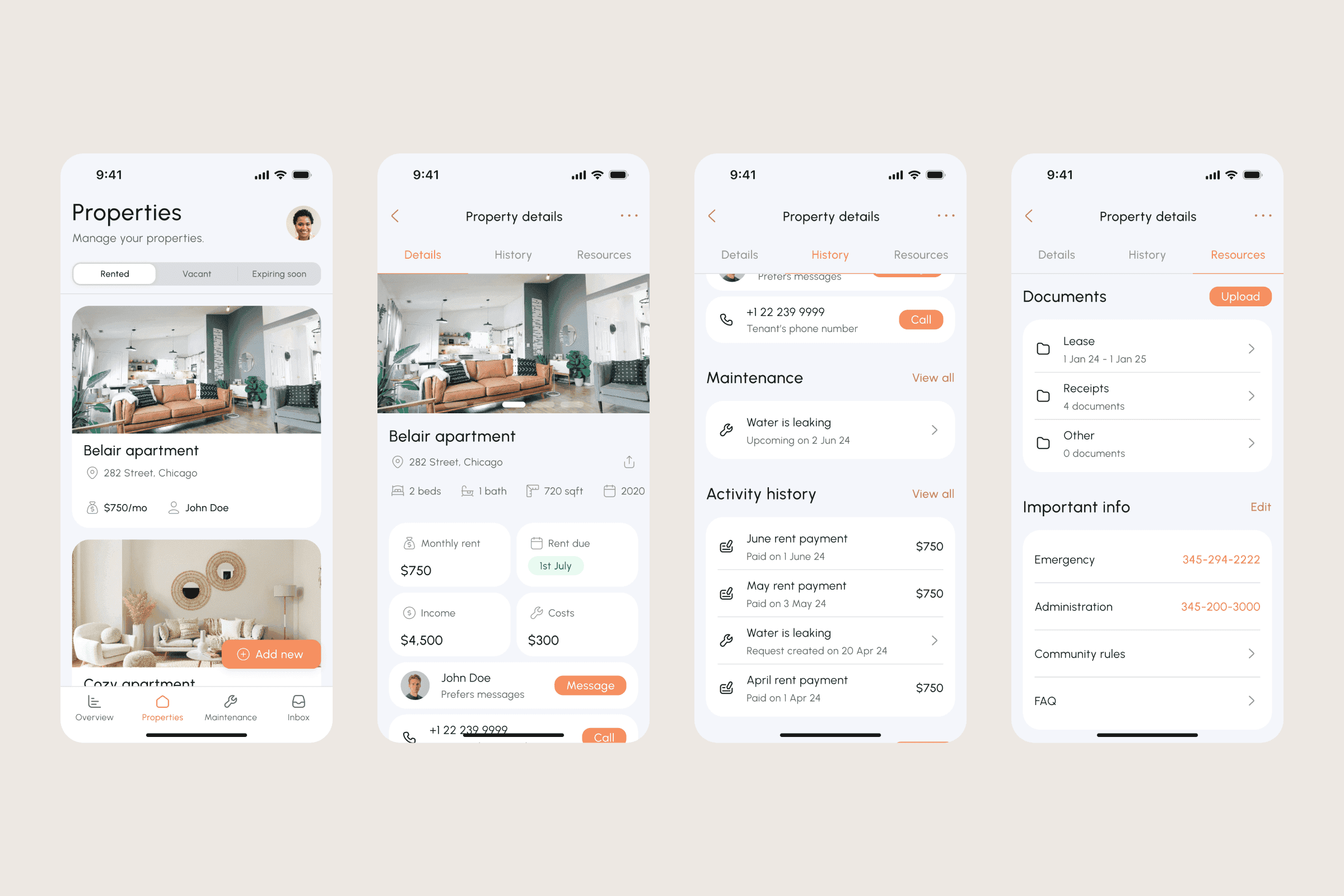
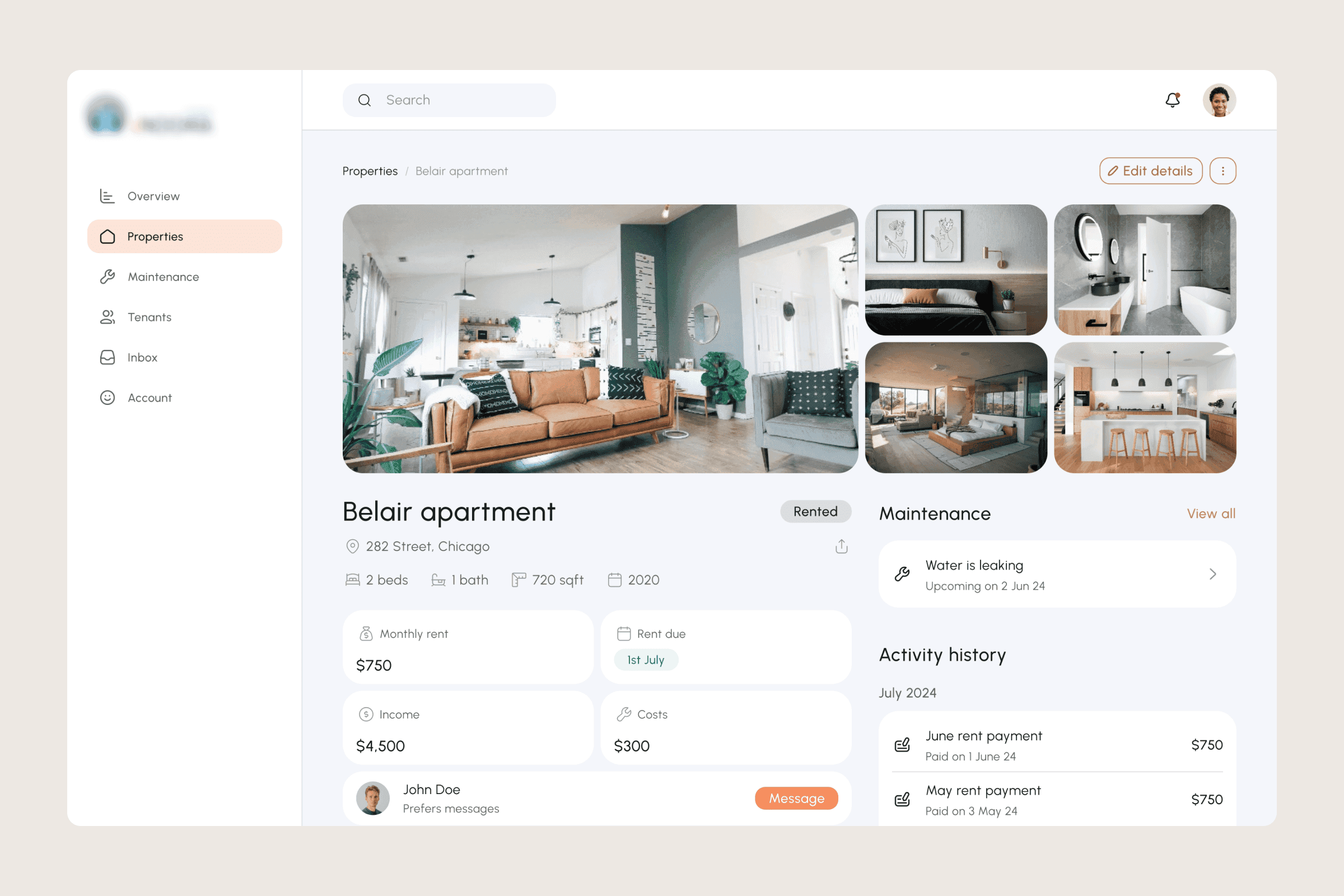
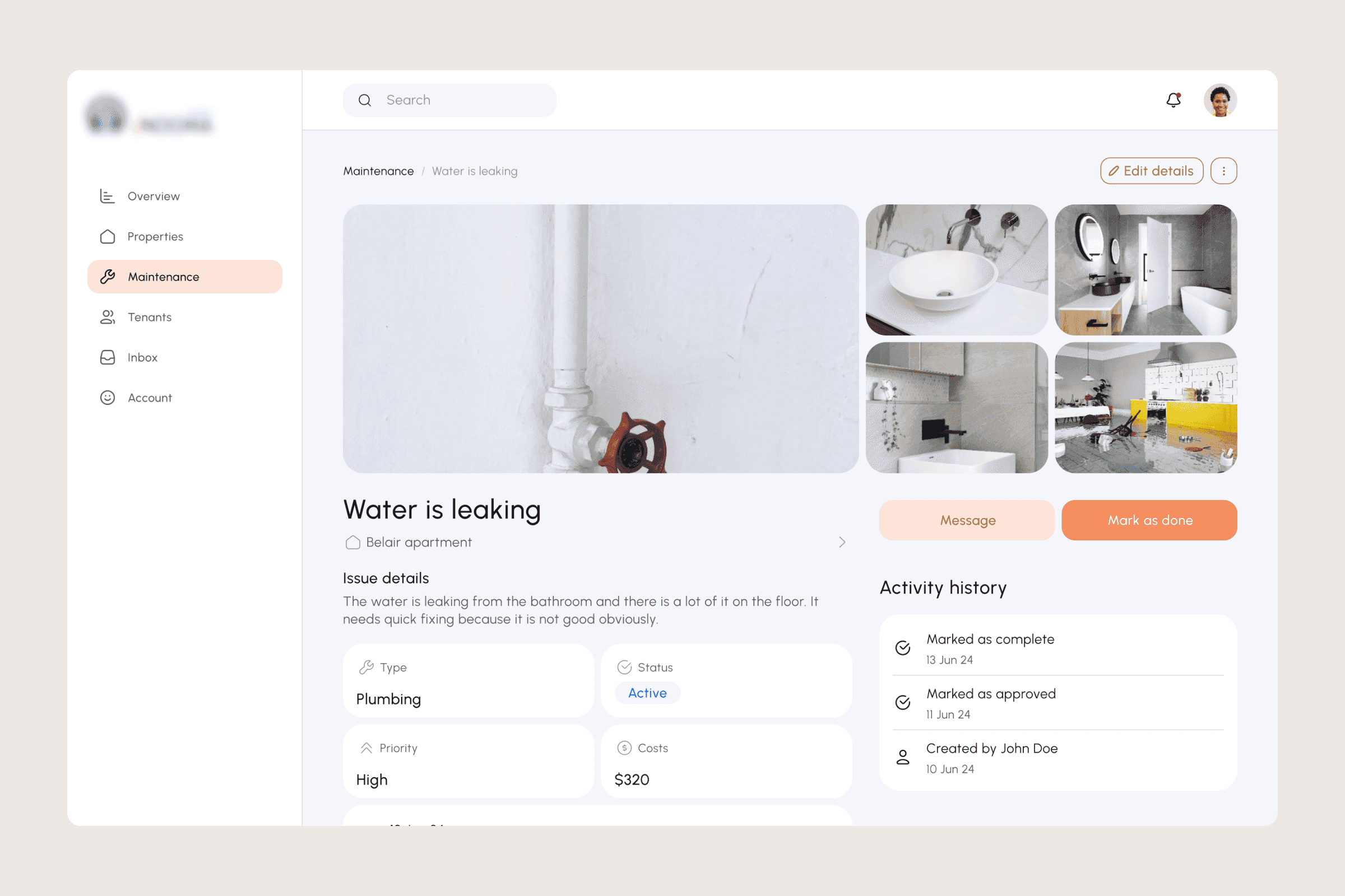
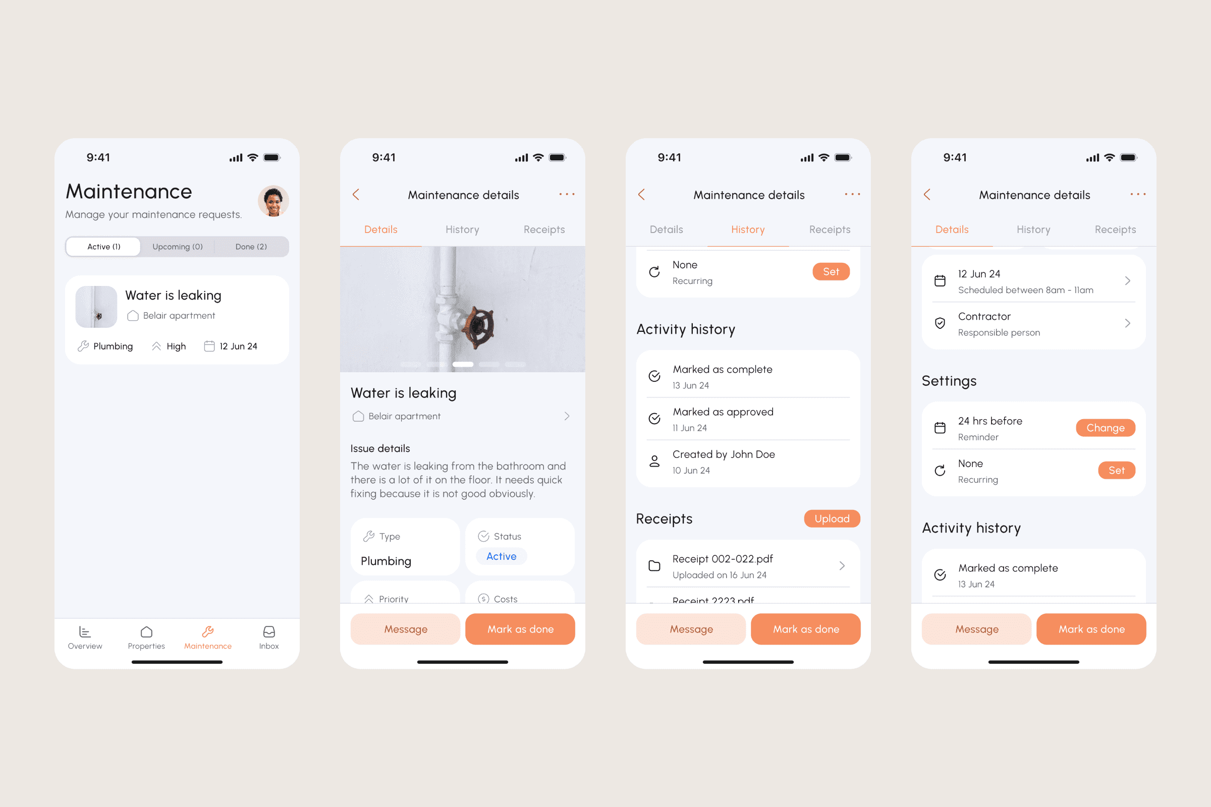
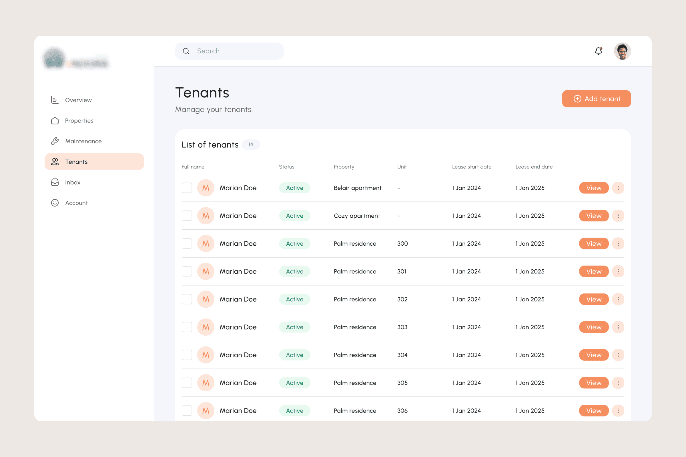
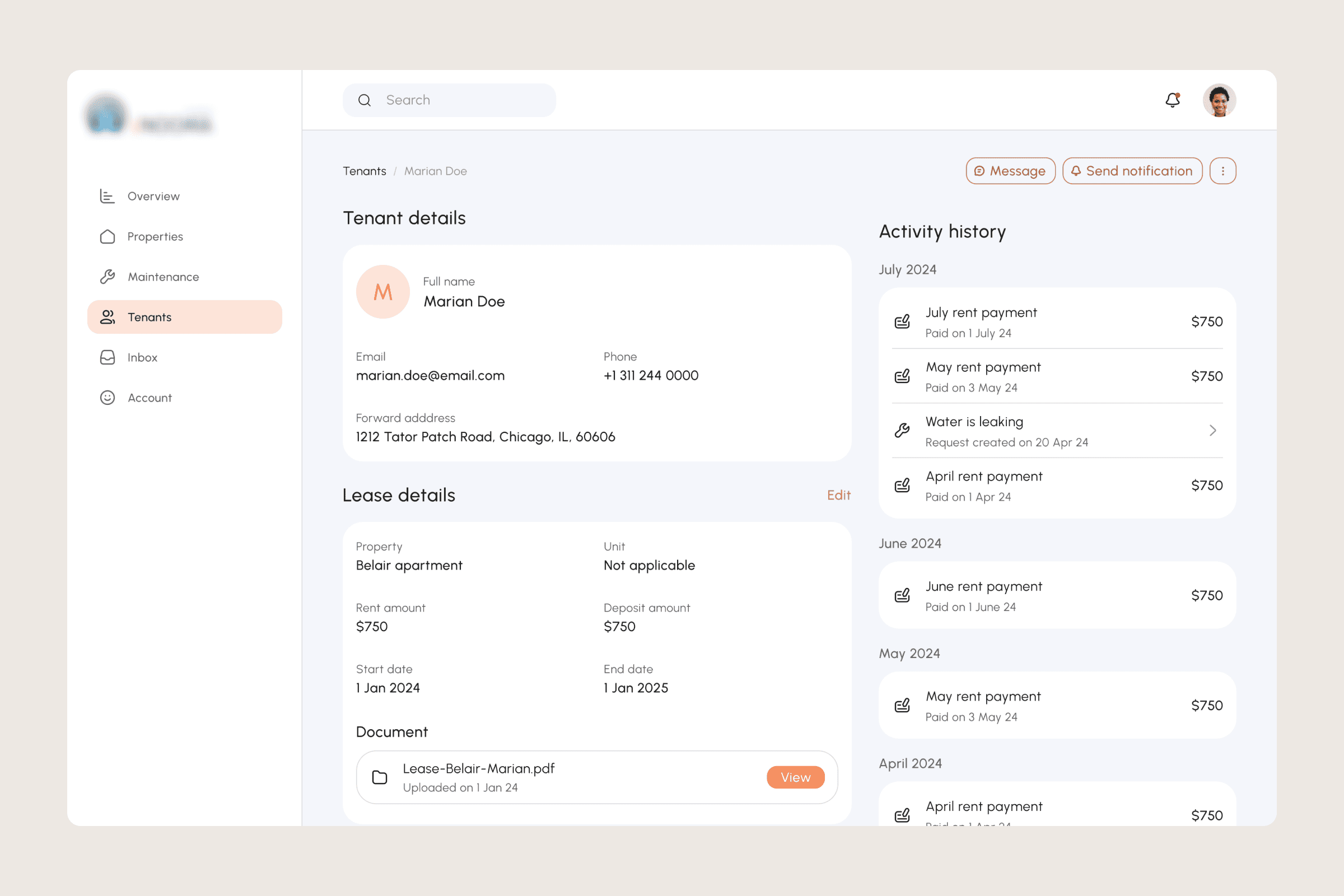
After receiving approval for the wireframes, I proceeded to develop precise and detailed mockups using Figma. I opted for a modern and clean aesthetic, selecting a relaxed color palette that exudes professionalism without overwhelming the viewer. Additionally, I subtly incorporated branding elements throughout the interface to maintain a cohesive appearance.
Building a design system
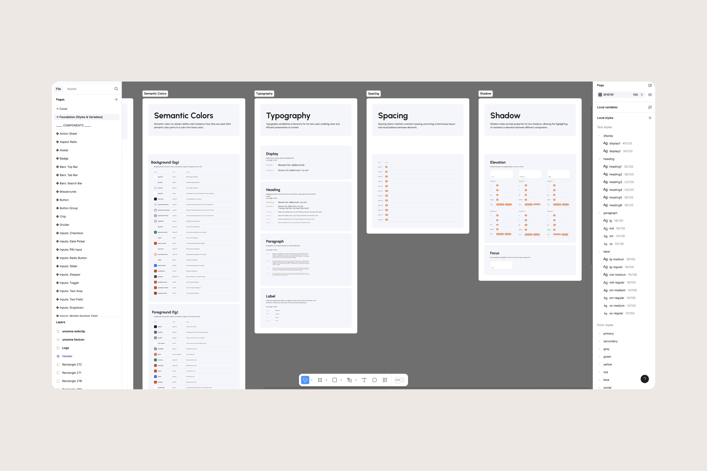
Early on, I put together a design system to keep the look uniform and make building it smoother. This touched everything from the typography we used and color scheme, to the style of buttons and forms, with a focus on making things work on all sorts of screens. I kept a sharp eye on making sure the design was accessible to everybody.
Essential design features
User-Centric Dashboards: I put together different dashboards for landlords and renters. They each got their own special tools and info right at their fingertips. Landlords could check out how their properties are doing, look after lease stuff, and keep an eye on the cash flow. On the flip side, renters got a super easy way to pay up ask for fixes, and hit up their landlords.
Responsive Design: I made sure the whole app could shift from web to tablets and phones. It is crucial to consider property management matters with utmost importance, as individuals will be accessing the system from various devices.
Straightforward Navigation: Tackling the tricky bits of managing properties, I zoomed in on crafting navigation that's a breeze to get. I put the important stuff right up front and mixed in some icons, words, and little hints so people can cruise through the platform without hiccups.
Outcome
The final design effectively achieved the client's objectives and met the needs of the users. This resulted in a property management platform that is both functional and visually appealing, making it easy for users to navigate. The development team responded positively to the high-fidelity mockups, which facilitated an efficient development process with minimal revisions.

